The Riverboats at the Gateway Arch award guests one of the best views of St. Louis’ working riverfront, the Gateway Arch and the city skyline. Narrated by the captain […]
This year, World Wide Technology Raceway will give travelers a million reasons to visit the Midwest. From Sept. 12 to 16, the premier racing facility will host the 28th annual […]
Here's a chart of PCE core inflation since 2021: The dashed red line is three months after the American Rescue Plan was passed. This is the absolute earliest it could have affected inflation, and by then the inflation rate had already spiked from 2% to 7%. It's really not plausible that ARP could have caused ...continue reading "Raw data: Inflation since 2021"
Gunners ready to be welcomed to the jungle at Busch Stadium were left waiting Friday night after Guns N' Roses postponed their Saturday show due to illness.
Techdirt has been writing about “evergreening” for many years. It refers to the practice by pharmaceutical companies of making small changes to a drug, often about to come off patent, in order to gain a new patent that extends its manufacturer’s monopoly control over it. The New York Times has a story about the Big […]
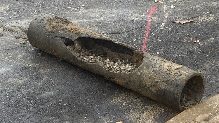
Residents in a University City subdivision are up in arms over a construction project next door. They say too many large construction vehicles are going in and out of their subdivision along Delmar and Kingdel, making life difficult for them.
Three teenagers who died last week after their vehicle smashed into a vacant University City home were fleeing from police in the moments leading up to the fatal crash.
 stLouIST